

What if the hottest housing markets are now cooling fastest?
FHFA data shows Florida led declines at -2.7% year over year in Q4 2025, with California and Texas each down 0.8% and several Mountain and Sun Belt states also slipping.
This post ranks the states with the biggest home price declines, explains the regional patterns and core drivers behind those drops, and shows what buyers, sellers, and investors should watch next.
Expect inventory surges, migration slowdowns, and rate sensitivity to be the main causes.
Ranked Overview of States With the Sharpest Home Price Declines
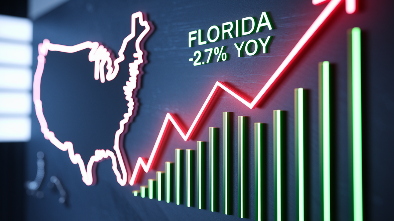
Florida’s home prices fell 2.7% year over year in Q4 2025, the steepest drop in the country according to the Federal Housing Finance Agency House Price Index. California and Texas both slid 0.8% over the same window. The FHFA also flagged annual declines in Montana, Colorado, West Virginia, Idaho, Georgia, Hawaii, and Washington, D.C., but didn’t publish specific percentages for those states in the quarterly release. Nationally, the index rose just 1.8% year over year in Q4 2025. That’s a sharp slowdown from the 4.6% gain in Q4 2024 and the 6.2% climb at the end of 2023.
A separate 90 day rolling average of single family pending sale median prices caught even more recent movement. Washington State led that group with a 0.9% decline, followed by Georgia at 0.8%, South Carolina at 0.3%, Montana at 0.2%, and Texas at 0.1%. These shorter term declines suggest price pressure accelerated late in the measurement window, particularly in states already showing annual weakness. The 90 day metric responds faster to shifts in buyer behavior and inventory levels. Annual comparisons smooth out monthly volatility and seasonal noise.
When you compare the two timeframes, the year over year numbers reflect a full cycle of seasonal activity and give you a clearer picture of trend direction. The 90 day average highlights momentum shifts that haven’t yet accumulated into large annual swings. States appearing in both datasets (Texas, Georgia, Montana) signal sustained downward pressure rather than a brief dip. For buyers and sellers, tracking both metrics helps separate a short correction from a sustained cooling trend.
| State | Percent Decline |
|---|---|
| Florida (YoY, Q4 2025) | -2.7% |
| California (YoY, Q4 2025) | -0.8% |
| Texas (YoY, Q4 2025) | -0.8% |
| Washington (90 day avg) | -0.9% |
| Georgia (90 day avg) | -0.8% |
| South Carolina (90 day avg) | -0.3% |
| Montana (90 day avg) | -0.2% |
| Colorado, West Virginia, Idaho, Hawaii (YoY, Q4 2025) | Decline noted, percent N/A |
| Washington, D.C. (YoY, Q4 2025) | Decline noted, percent N/A |
Regional Housing Downturn Patterns Behind State Level Price Drops

The FHFA census division breakdown reveals where weakness is clustering. The Pacific division fell 0.4% year over year in December 2025, the South Atlantic dropped 0.1%, and the Mountain division declined 0.6%. That’s a 5.5 percentage point reversal from the prior year’s 4.9% gain. Those three divisions cover the bulk of the states with the largest declines. California and Washington sit in the Pacific, Florida and Georgia anchor the South Atlantic, and Colorado, Montana, and Idaho fall within the Mountain region. In contrast, the Midwest posted positive gains across both its census divisions. The West North Central division rose 3.9% year over year and the East North Central added 5.2%, down slightly from 5.1% and 6.8% respectively a year earlier, but still comfortably in positive territory.
The divergence reflects different demand supply fundamentals. Midwest metros held tighter resale inventory and benefited from steadier local employment and slower pandemic era price runups, leaving less room for correction. Western and Sun Belt divisions saw larger inflows during 2020 to 2022, faster price appreciation, and now face larger inventory buildups as those migration flows level off or reverse. The result is a geographic split where states that boomed hardest are now cooling fastest, while states that gained more modestly continue to post small but stable appreciation.
Five regional signals help explain the pattern:
Inventory growth concentrated in Western and Sun Belt states, flooding supply faster than buyers can absorb it.
Post pandemic migration pullback, with fewer households relocating to former hotspots like Austin, Miami, and Boise.
Affordability strain hitting hardest in states with the steepest pandemic era runups, narrowing the buyer pool.
Oversupply in markets that overbuilt during the boom, leaving developers and sellers competing for thinner demand.
Rate sensitivity amplified in rate shocked states, where double digit appreciation collided with mortgage costs jumping from 3% to over 7% in two years.
Core Drivers Behind the Biggest State Housing Price Declines

Buyer demand has weakened across most states showing price declines. Total pending sales contracts sat 3.5% below the prior year’s level, meaning fewer committed buyers are entering the market even as inventory climbs. In Texas, prices on pending contracts rose at a 2.6% clip in November, then fell three consecutive weeks. Florida saw a similar reversal. Pending median prices climbed roughly 2.4% through December and mid January before dropping to a 0% annual gain within a month. That kind of momentum shift signals that buyers pulled back sharply and suddenly, often in response to a rate move, affordability threshold, or inventory spike. When pending sales decline while listings rise, price pressure builds fast.
Rising inventory is the clearest common thread. California added 49.5% more single family homes for sale compared to a year earlier. Maine inventory jumped 43%, Arizona rose 42.6%, Florida climbed 38.4%, Tennessee grew 38.7%, and Texas increased 30.4%. Only North Dakota saw inventory fall, down 11.7%. Those year over year gains mean sellers are competing against twice as many listings in some metro submarkets, forcing concessions and price cuts to attract the smaller buyer pool. In Sun Belt metros that once saw bidding wars, the new normal is negotiation, longer days on market, and sellers pricing below recent comps to close deals. Inventory isn’t just up. In many cases it’s up sharply enough to flip the power balance from seller to buyer in a matter of months.
Economic and demographic adjustments are also at work. Texas and Florida metros such as Austin and Miami drew large inflows during the pandemic, driven by remote work, lower taxes, and perceived lifestyle gains. As companies tightened return to office policies and cost of living premiums in those metros rose, some of that migration reversed or slowed. At the same time, states with steadier economic bases (think Midwest metros anchored by manufacturing, healthcare, and education) saw less volatility in both directions. The result is a recalibration. States that overshot on price are giving back some of the gain, while states that appreciated modestly continue to track local wage growth and fundamentals without major corrections.
How Inventory Surges Are Driving State Level Price Weakness

When supply outpaces demand, prices adjust. In the states with the steepest declines, inventory growth has been severe. California’s 49.5% year over year jump means nearly half again as many homes competing for buyers. Maine’s 43% rise is particularly notable for a smaller state where inventory historically moved slowly. Arizona at 42.6%, Florida at 38.4%, Tennessee at 38.7%, and Texas at 30.4% all reflect the same pattern. Builders kept delivering units and existing owners listed properties into a market where buyer appetite had already cooled. The mismatch creates downward price pressure because sellers either drop their ask or watch their listing sit. In markets where inventory doubled in certain price tiers, the effect on median prices can be swift and visible within a single quarter.
Month to month inventory changes matter as much as the annual comparison. A state can show a large year over year inventory gain but still stabilize if new listings flatten each month. But if listings keep climbing week after week while pending contracts fall, the imbalance worsens and price cuts accelerate. The states posting the largest declines are the ones where inventory hasn’t yet plateaued. Sellers in those markets face a choice: price aggressively now to capture the remaining buyers, or wait and risk further softening as more inventory arrives. That’s why average days on market has climbed and the share of listings with price reductions has spiked in these states. Sellers are reacting to real time competition, not abstract data.
Key inventory shifts driving price pressure:
California inventory up nearly 50%, overwhelming coastal and inland metros alike.
Florida and Texas posting over 30% gains, with Sun Belt metros losing bidding war dynamics.
Maine and Arizona each adding over 40% more listings, forcing rural and suburban sellers to compete harder.
North Dakota as the lone exception with inventory falling 11.7%, correlating with its strong price gains (up 6.4% year over year).
State Economies and Local Market Conditions Shaping Declines
Employment stability and migration trends determine how much demand a state can sustain. Sun Belt metros like Austin and Miami attracted large inflows during 2020 to 2022, boosting prices rapidly. As corporate return to office policies tightened and the remote work premium faded, some transplants left or paused plans to move, reducing the buyer pool. At the same time, local wage growth in those metros hasn’t kept pace with the cost of living increases that followed the boom, squeezing affordability for residents who stayed. States with more diversified economies (manufacturing bases in the Midwest, tech and finance hubs in the Northeast) experienced smaller swings in both directions because demand remained tied to stable local employment rather than transient migration waves.
Tax policy, insurance costs, and regulatory factors also influence long term price trends. Florida’s lack of a state income tax once made it attractive for high earners, but property insurance premiums have spiked due to hurricane exposure and insurer exits, adding hundreds of dollars per month to total housing costs. Texas similarly saw property tax bills climb as home values surged, eroding some of the cost advantage that initially drew buyers. When total monthly outlays (mortgage, insurance, taxes, HOA fees) rise faster than incomes, fewer households qualify at a given price point, and sellers must adjust downward to find buyers who can close. Those structural cost shifts are harder to reverse than a temporary rate move, making them a persistent drag on price support.
Climate risk and insurance availability are becoming long term demand headwinds in certain states. Coastal Florida markets face rising flood insurance premiums and increasing awareness of storm damage risk. California deals with wildfire insurance non renewals in certain zones, forcing buyers to pay significantly higher premiums or self insure. Over time, those risks can dampen buyer willingness to pay top dollar, especially when comparable homes in lower risk states become more affordable. The price declines seen in Florida and California aren’t solely about inventory and rates. Part of the correction reflects buyers pricing in elevated long term ownership costs and re evaluating the premium they’re willing to pay for Sun Belt or coastal locations.
Understanding the Difference Between State and Metro Price Declines

State level price averages can mask significant metro to metro variation. A state might show a modest decline overall while one large metro drops sharply and smaller markets stay flat or rise. Texas reported a 0.8% annual decline statewide, but Austin fell 4.2% year over year while San Antonio dropped 1% month over month in January and 3.8% year over year. Those metro specific moves are larger than the state figure because other Texas metros posted gains or smaller declines, pulling the average up. Buyers and sellers care most about their specific metro or submarket, so relying on state data alone can give a misleading picture of local conditions. The FHFA index aggregates repeat sales across all conforming mortgages in a state, smoothing out the peaks and valleys that define individual metro experiences.
Metro level trends also reveal the regional split more clearly. Northeast and Midwest metros benefited from tighter resale supply and steadier demand. Philadelphia rose 2.6% month over month in January, Providence climbed 2.5%, and San Francisco jumped 2.1%. New York City gained 11.1% year over year and Milwaukee added 9.2%. In contrast, Sun Belt and Western metros faced weaker dynamics. Warren, Michigan, fell 1.5% month over month, Minneapolis dropped 0.8%, Los Angeles declined 0.72%, and Jacksonville slid 3% year over year. The divergence reflects inventory imbalances and migration shifts playing out at the metro level, where supply demand mismatches are more pronounced than in statewide aggregates.
| Metro | MoM % (January) | YoY % |
|---|---|---|
| Austin, TX | -0.03% | -4.2% |
| San Antonio, TX | -1.0% | -3.8% |
| Jacksonville, FL | N/A | -3.0% |
| Warren, MI | -1.5% | N/A |
| Los Angeles, CA | -0.72% | N/A |
| Minneapolis, MN | -0.8% | N/A |
Visualizing the States With the Biggest Home Price Declines

Charts and maps turn raw percentages into patterns you can spot immediately. A ranked bar chart showing each state’s year over year change puts Florida’s 2.7% decline and North Dakota’s 6.4% gain side by side, making the spread obvious. A choropleth U.S. map colored by inventory growth highlights the Sun Belt and West as hot zones for oversupply, while the Midwest and parts of the Northeast stay cooler. Time series lines tracking national year over year growth from 2019 through 2025 show the steep deceleration from 6.2% at the end of 2023 to 1.8% in Q4 2025, illustrating the broader slowdown that makes individual state declines less surprising. Visual tools help you see both the geographic and temporal dimensions of the shift without needing to parse tables of numbers.
Four formats work especially well for state level price analysis:
Ranked bar chart of state price changes, showing declines in red and gains in green, sorted from largest decline to largest gain.
Choropleth map of year over year inventory percent change, revealing which states face the most severe supply pressure.
Time series chart of national FHFA HPI annual growth from 2019 to 2025, contextualizing the current slowdown within the post pandemic cycle.
Cross reference table pairing price change, inventory growth, and pending sales trend for the top declining and gaining states, letting you compare all three variables at once.
Final Words
Prices are cooling across several states – Florida led with a 2.7% YoY decline and national growth slowed to 1.8% in Q4 2025. The post ranked which states show the sharpest drops.
Higher mortgage rates, rising inventory, and migration shifts are the main drivers. Ninety-day averages show where weakness is accelerating versus where year-over-year still looks milder.
If you’re buying, selling, or advising, watch inventory, pending sales, and local jobs. Our states with biggest home price declines explained shows risk and opportunity, and selective chances to act.
FAQ
Q: What states have declining housing prices and where is real estate declining the most?
A: The states with declining housing prices include Florida (-2.7% YoY), California (-0.8%), Texas (-0.8%), plus Montana, Colorado, West Virginia, Idaho, Georgia, Hawaii and Washington, D.C.; declines cluster in Western and Sun Belt metros.
Q: What is the 3-3-3 rule in real estate?
A: The 3-3-3 rule in real estate is a common budgeting shorthand: plan for about 3% down, roughly 3% in closing costs, and three months of mortgage reserves, though specifics vary by market.
Q: Is there going to be a housing crash in 2026?
A: A housing crash in 2026 is unlikely; national prices rose 1.8% YoY in Q4 2025 and slowed, but watch higher rates, rising inventory, and local metro weakness for sharper, localized drops.